Apparently this is the second year that Cherry Creek Arts Festival has done the Colorado Artist Image Review Workshop. I missed any announcement of it last year and thought it might be of value to sign up. I've seen on this Blog that other festivals are also hosting this type of review. I hope the trend continues with other festivals as well!
Terry Adams of the Cherry Creek show was there with his support team, a representative of Zapplication and I especially enjoyed meeting Jerry Gilmore who acted as the juror/review person for this event. He seems to be popping up quite a bit as of late, just heard him on the BlogTalkRadio presentation as well. He was very gracious and generous with his time answering questions for this event.
To say the least, as Jerry pointed out, if you haven't seen your slides projected before an audience, or even projected them on your own, it is WELL worth it. Terry told of one artist last year who stormed out of a presentation. He followed him out and asked what the problem was. The artist reported being quite embarrassed at the quality of his work when presented this way and he was on his way home to fix it! Although I didn't storm out I too was disconcerted about how one of my images presented when projected. Had I not been in this presentation I might never have known that this one image (out of the 40 or so I have on Zapp) was formatted differently and thus showed up washed out and lifeless. It is one that I have used quite frequently as-of-late so I was concerned about the impression I was making! I too immediately went home and went about the business of finding out what was wrong. I dropped an email to Larry Berman about it and he was quite gracious about helping me as well. It was only after reviewing all of my stored images (not the ones stored on Zapps website) that I found the problem with this culprit. Zapp requests that images be stored in sRGB mode and wouldn't you know it, this was the only one that wasn't.
Although no guarantee of how your images will appear when projected one of the things you might do is preview them in a browser window. When I did the "Preview As a Juror" on Zapp this inconsistency in image quality did NOT show up.
So back to the issue at hand. The other eye opener was the difference in quality of images depicting people's booths. I've done a lot of work this year myself to make the best presentation possible after getting some useful feedback from Jim DeLutes and was rewarded with a complement by Jerry saying that my presentation was very professional. Some of the others at the review had a long way to go. And cropping of your booth shot. I thought that I had it pretty tight but got some feedback suggesting that I crop it even tighter!
Pre-review Booth Shot: 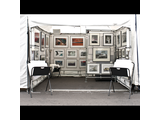 Review Booth Shot
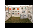
I'm especially sensitive to the idea of large blobs of white in an image, especially when you consider that the jurors are sitting in a dark room for long periods of time and a big white area will tend to blind you when it comes up on the wall/screen. I tried to bring down the brightness in the second image but it started to turn to grey so I left well enough alone. You can see in my second image that I removed the bins and really cropped the booth down very close. It should be noted that some shows want to see everything that you will have in your booth including the bins and chairs!
Some things that struck me about some other booth shots were, browse bins that were pointed into the light so that they looked like shining beacons in the sun (see mine above left), bins that obscured what was in the booth, chairs that obscured what was in the booth, etc. Jerry pointed out how backgrounds can tend to swallow the art, there needs to be contrast between your background and your art. For jewelers, especially if your work is small, it's nice to see professional display cases but if you can't see the jewelery, hanging large photo posters on the back wall is better than the lovely swag fabric. Also, it is a good way for people on the street who can't get through the crowd to preview your work. Oh, and by the way, lose the posters with your name or the company name in the background, jury's are not supposed to see names, the same goes for paintings, etc. use a photo editing program and get rid of the signatures or names.
As for cropping those art images, I know this seems quite elementary, but if you have 2D work lose the frame, unless...it is an integral part of the art. It is easier for a photographer to have images of their work especially in these days of digital capture but if you are taking pictures of your 2D work for gosh sakes make sure it is square to the frame! There were several images in this presentation that looked like they were taken from the side which created a distorted perspective (like looking down a tunnel).
Finally, bodies of work, I struggled with this one myself. Juries want to see a cohesive body of work. At first I thought it better to show a range of work, uh uh. Tis better to show that you have an ongoing theme rather than a smattering of this and that. One artist at the review was arguing this point and still insisted that their body of work was ALL of their work, good luck with that. I appreciate that they like to take images of whatever, I like diversity also, but when it comes to a jury I put my best foot forward and show a cohesive body of work, whatever it is.
All-in-all it was really instructive to participate in this kind of event both for what needs help as well as what looks good. If you have the opportunity to go to a show preview do so.