I think I pretty much just floated through December with nothing much to show for it besides a few extra pounds (or more) from the Holidays.
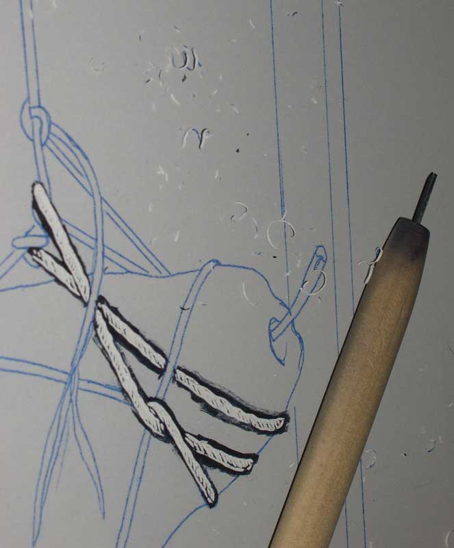
I finally returned to my current project "Testing Gravity" last week. I've been doing a lot of thinking, but not doing much. Here's some pics of the progress so far. This is a little blurry, but I have some good textures in the string.

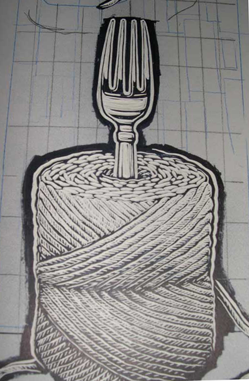
The fork was rather difficult. I didn't know quite how I wanted to render it. Metal is really hard to represent when there are no grey tones. I think it turned out alright.


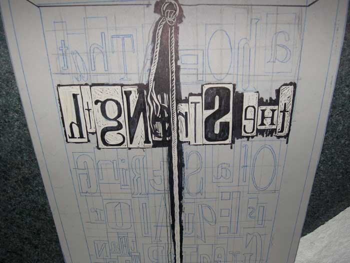
I decided to add a quote to the backround. I will eventually cut a second plate using a brown color that will subdue the quote in the backround so it won't be so dominent. Once the second color is added I'd like the backround to look more like a texture than type, but still readable. I like the thought of make the viewer search to find the meaning to a piece. I really like the effect, but carving the type is going to take a REALLY long time! This line alone took around 2 hours. Probably 3 if you count all of the breaks I took to readjust my eyes!
The quote says "A hope that the strength of a string is equal or greater than the pull of gravity".
More later.

Comments
Thanks for your comments. This is a linocut (carving into linoleum).
Nice work, Lori. Is that carved into wood?
Jacki B
Tell me more, Lori. What are you doing? Is this etching?
Wow Lori, that is some awesome carving!